Grid Alternate: A Pixel-Perfect Display Font for Bold Digital Branding
Last week, I was finalizing the hero section of a new landing page for a creative coaching practice — clean layout, muted background image, and a strong headline that needed to feel both human and unmistakably modern. I opened my font library, scrolled past the usual suspects, and landed on Grid Alternate. Instantly, it clicked: this wasn’t just another pixel font. It’s a display font with intention — jagged yet balanced, retro-futuristic but not kitschy, playful without sacrificing clarity.
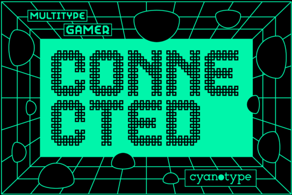
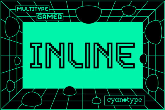
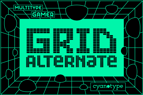
Grid Alternate stands out because it leans into its pixelated roots while avoiding nostalgia overload. Each character has a subtle distortion — like a signal gently bending through digital static — giving it motion and texture even at rest. It’s not monospaced, but it *feels* grid-aligned; letters breathe within an implied lattice, making it ideal for designers who care about rhythm and structure. As a display font, it’s built for impact, not endurance — perfect for moments where you want users to pause, recognize tone, and remember voice.
I tested Grid Alternate in three real contexts: first as the main headline over a soft gradient banner (64px on desktop, 42px on mobile), then as a section divider (“What You’ll Build” → “Your First Module”), and finally as a button label on a course signup form (“Start Your Journey”). In each case, it performed best when used sparingly — never for body copy, never for long paragraphs, and never below 28px on mobile. At smaller sizes or in dense UI patterns, the pixel edges begin to blur on lower-DPI screens, so I reserved it strictly for high-impact, short-form text.
That said, Grid Alternate shines brightest where personality matters most: portfolio site headers, boutique online store banners, campaign landing pages, and digital brand kits. On a recent redesign for a small ceramics studio’s online shop, we used Grid Alternate for their seasonal collection title (“Clay & Current”) above a full-width product carousel. Paired with a warm, airy sans serif (Inter, set at 18px/1.6 line height) for product names and descriptions, it created visual contrast without clashing — the kind of hierarchy that guides the eye without shouting.
Readability is highly context-dependent with Grid Alternate. On light backgrounds, it’s crisp and confident. Over dark images or deep gradients, I added a subtle white stroke (via text-stroke in CSS) rather than relying solely on drop shadows — cleaner, more performant, and easier to maintain across breakpoints. For mobile previews, I made sure the font loaded early via font-display: swap, and confirmed it rendered legibly even on older iOS devices by testing with system font fallbacks defined in the @font-face stack.
One thing I appreciated right away: Grid Alternate is PUA encoded. That means custom glyphs — alternate characters, stylistic ligatures, or decorative elements — are accessible without complex OpenType features. In Figma, I toggled between standard and “glitch” alternates directly from the glyph panel. In code, it meant using Unicode values to insert unique accents — like a fragmented ampersand in a tagline — without bloating the font file.
Font pairing is where Grid Alternate really earns its place in a modern toolkit. Think of it as the lead vocalist: bold, expressive, impossible to ignore. It needs a grounded, reliable supporting typeface — usually a neutral sans serif (like Inter, Manrope, or Recursive) for UI labels, navigation, and body text. For editorial-style blogs or storytelling landing pages, a quiet serif (such as Literata or Cormorant Garamond) adds sophistication without competing. The key is contrast in weight, proportion, and purpose — not similarity.
Before deploying Grid Alternate on any live project, I always check three things: webfont availability (WOFF2 only, thankfully lightweight), included weights (it ships with one robust weight — ideal for display use), and commercial licensing. It’s a premium font, and the license clearly covers web, app, and digital template use — no surprises when handing off assets to clients or uploading to Shopify or Webflow. No multilingual support beyond Latin-1, so I avoided it for projects requiring extended diacritics or non-Latin scripts.
In practice, Grid Alternate works best when treated like a design accent — not a system font. I’ve used it successfully for:
- Hero headlines on SaaS feature pages
- Section headers in digital brand guidelines
- Short CTAs in email campaign banners
- Logo lockups (as secondary wordmark, never primary)
- Social media cover graphics and story highlights
It’s not for every brand — a financial dashboard or legal resource site would feel misaligned — but for creators, coaches, indie makers, and digital-first studios? Grid Alternate delivers authenticity with polish. It says “I’m thoughtful about craft” without saying “I’m trying too hard.”
What surprised me most wasn’t how eye-catching it was — that was expected — but how well it held up under real constraints: fast loading, responsive scaling, cross-browser rendering, and accessibility review. With proper contrast ratios (I verified AA compliance at 48px+ on light/dark backgrounds), clear hierarchy, and intentional spacing, Grid Alternate doesn’t just look cool — it supports comprehension and reinforces brand confidence.
If you’re choosing a display font for your next digital project, ask yourself: does it reflect the energy your audience should feel before they even read the first sentence? Grid Alternate does — decisively, memorably, and with zero visual noise.