Look Like Coffee: A Modern Display Font for Digital Design
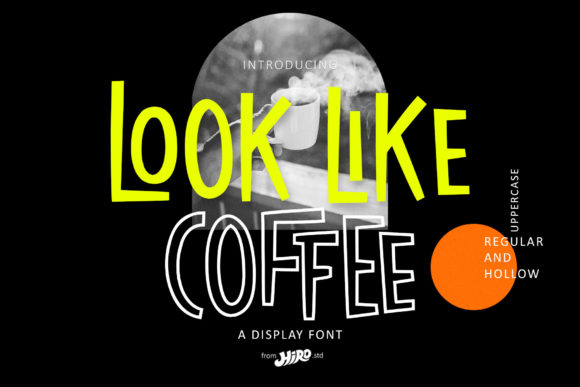
As a UI designer who builds landing pages, SaaS dashboards, and boutique e-commerce experiences, I reach for display fonts not just for flair—but for function. Look Like Coffee stands out because it delivers strong visual identity without sacrificing digital clarity. It’s a contemporary display font with clean, confident letterforms—slightly condensed, subtly geometric, and balanced between warmth and precision. The lowercase “a” and “g” carry quiet personality, while uppercase letters hold tight rhythm and spacing ideal for screen legibility.
This isn’t a script or handwritten font—it’s designed to command attention in hero sections, product headlines, and branded banners where you need tone *and* scannability. On mobile, its open counters and consistent stroke contrast hold up well at 32–48px, especially against light backgrounds or soft image overlays. For dark mode interfaces, I recommend testing the regular weight at 40px with 1.2 line-height and subtle text-shadow (1px 1px 2px rgba(0,0,0,0.2)) to preserve definition.
Where Look Like Coffee Earns Its Place in Your Layout
In real-world web projects, Look Like Coffee performs best where hierarchy needs emphasis—not as body copy, but as intentional punctuation. Think of it as your typographic accent: the bold voice behind a headline, the polished finish on a CTA button, or the unifying thread across a brand’s visual language.
- Landing pages: Use it for H1s above scroll, paired with a neutral sans serif like Inter or Manrope for subheads and body. Its confidence helps convert visitors by reinforcing brand authority in under two seconds.
- Online stores: Apply it to category banners (“Handcrafted Ceramics”), limited-edition labels, or hero slides (“Summer Edit Live Now”). Avoid using it for price tags or filter menus—stick to highly legible system fonts there.
- Course & coaching sites: It adds approachable sophistication to section headers like “What You’ll Build” or “Join 2,400+ Designers”—balancing expertise with human tone.
- Portfolio & creative agency sites: Works beautifully in logo lockups, project titles, and testimonial highlights—especially when paired with a crisp monospace or geometric sans for supporting text.
Readability, Responsiveness, and Real-World Constraints
Display fonts live or die by how they behave outside ideal conditions—and Look Like Coffee handles constraints thoughtfully. Its PUA encoding means ligatures, stylistic alternates, and extended Latin characters render reliably across modern browsers when served as WOFF2. That’s critical for multilingual client sites or global-facing SaaS tools where accented characters (like “café” or “naïve”) must appear correctly without fallback glitches.
On small touch targets—like mobile CTA buttons—I use it at minimum 24px with generous letter-spacing (0.5px) and ample padding. Never cram it into under 20px or overlay it directly on busy imagery without a subtle backdrop or blur. For accessibility, always pair it with a WCAG-compliant body font and maintain at least 4.5:1 contrast against background colors.
Smart Pairing for Cohesive Digital Identity
A great display font doesn’t stand alone—it anchors a system. With Look Like Coffee, I default to pairing strategies that reinforce clarity and intention:
- Sans serif foundation: Inter, Work Sans, or IBM Plex Sans provide neutral, highly readable body copy that lets Look Like Coffee shine in headings without competing.
- Serif contrast: For editorial or premium brand sites (think newsletters, course syllabi, or brand guidelines), try it with Literata or Cormorant Garamond—creating a dynamic yet trustworthy voice.
- Avoid over-decoration: Skip pairing it with other display or script fonts. Its strength is focus—not layering.
Also note: check what’s included in your license. Most versions ship with Regular and Bold weights, basic OpenType features (ligatures, small caps), and support for Western European languages. If your project requires Cyrillic, Greek, or Vietnamese, verify coverage before finalizing layouts.
Licensing, Delivery, and Practical Integration
Look Like Coffee is a commercial font—and that matters for web designers shipping client work, selling digital templates, or powering subscription-based platforms. Always confirm your license covers web embedding (via @font-face or third-party hosts), number of domains, and whether it permits use in SaaS applications or white-labeled dashboards. Some licenses restrict usage in editable design assets sold on marketplaces—so review terms before bundling it into Figma kits or Notion templates.
For fast implementation, serve it via self-hosted WOFF2 files (smallest size, broadest support) and declare font-display: swap to avoid invisible text during load. In CSS, define it as a primary font-family only for targeted elements—not globally. This keeps performance lean and typography intentional.
Ultimately, Look Like Coffee earns its place not because it’s trendy, but because it solves real problems: tightening visual hierarchy, elevating brand perception without pretension, and holding its own across devices and contexts. It’s the kind of display font that feels like a collaborator—not decoration. When your homepage headline needs to say “we understand design,” or your checkout banner should whisper “this matters,” Look Like Coffee delivers tone, trust, and technical reliability in one package.