Red Storm: A Bold Display Font That Commands Attention Online
I was deep in the final round of a boutique coaching site redesign—hero section nearly locked, image banner set, and CTA button styled—when something felt off. The headline just… didn’t land. It was legible, sure, but it lacked presence. Not warmth, not elegance—but impact. That’s when I pulled up Red Storm: a cool, bold, thick-lettered display font I’d bookmarked months ago but hadn’t yet tested in a live layout. Within five minutes of dropping it into the hero heading, the whole page shifted—not just visually, but energetically.
What Red Storm Brings to Digital Layouts
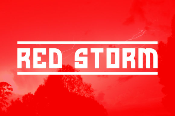
Red Storm isn’t subtle—and it’s not meant to be. As a display font, it’s engineered for moments that need to stop scrolling: hero titles, section headers, call-to-action banners, and branded digital assets like course landing pages or portfolio intros. Its letters are tightly spaced, generously weighted, and built with confident geometry—no frills, no flourishes, just strong, grounded presence. It reads as modern but timeless, energetic but trustworthy. On screen, it holds its own against high-contrast imagery, subtle gradients, and even busy background textures—something many decorative fonts struggle with at scale.
How It Performs Across Devices and Contexts
I tested Red Storm across real scenarios: a mobile-first product landing page, a desktop portfolio header, and a dark-mode blog banner. Here’s what stood out:
- On mobile: At 36px and above, Red Storm remains crisp and legible—even on mid-tier OLED screens. Its thick strokes prevent visual “thinning” on smaller viewports, unlike lighter display fonts that can disappear at small sizes.
- Over images: I layered it over a muted lifestyle photo (with a subtle CSS backdrop-filter overlay), and the contrast held beautifully. No need for heavy drop shadows—its inherent weight creates natural separation.
- In buttons and CTAs: Used at 20–24px in a primary button, it added instant authority without sacrificing clarity. Just avoid pairing it with ultra-thin icons or overly delicate hover animations—the tone mismatch distracts.
- In dark mode: With proper contrast ratios (I verified using browser dev tools), Red Storm shines on charcoal or navy backgrounds. Its clean terminals and open counters keep it readable where ornate fonts blur or fade.
Where Red Storm Excels—and Where to Pause
This is a display font, first and foremost. That means it thrives in short, intentional bursts—not long paragraphs. I tried it for a testimonial block (just the quote author’s name) and loved how it anchored the statement. But when I briefly swapped it in for body copy? Instant readability fatigue. Same goes for navigation menus, form labels, or table headers—its density works against scanning efficiency in dense UI contexts.
It’s also not ideal for interfaces requiring WCAG AA/AAA compliance *without careful implementation*. While Red Storm itself isn’t inaccessible, its tight spacing and uniform stroke weight mean you’ll want to pair it with generous line-height, ample letter-spacing in all-caps usage, and always test contrast against your chosen background. For accessibility-critical projects—like health or finance dashboards—I’d reserve it strictly for top-level branding elements, not functional text.
Smart Pairing for Real Web Projects
Red Storm sings when paired with a quiet, highly legible sans serif—think Inter, Manrope, or even system fonts like -apple-system or Segoe UI. I used it with Inter (Regular and SemiBold) across an online course sales page: Red Storm for the headline (“Build Your First Client Pipeline”), Inter for subheads, benefits, and pricing details. The contrast created clear hierarchy without competing energies.
For more editorial or boutique-leaning sites—say, a ceramicist’s portfolio or a slow-living blog—I’ve paired Red Storm with a warm, low-contrast serif like Cormorant Garamond or Literata. The serif softens the display font’s intensity while keeping sophistication intact. Avoid pairing it with other bold display fonts or script fonts unless you’re aiming for deliberate, high-contrast graphic design (e.g., a limited-run campaign banner)—not everyday UI.
Practical Considerations Before You Deploy
Before adding Red Storm to your next project, check three things:
- Webfont support: Confirm the vendor provides WOFF2 files and a clean @font-face declaration. Some display fonts ship only as desktop OTF/TTF—fine for mockups, but not production-ready web use.
- Weights & alternates: Red Storm includes one strong weight (ideal for headlines), but no light or italic variants. That’s fine—it’s not meant to carry typographic range. Just know you’ll rely on your secondary font for variety.
- Licensing for commercial use: Verify the license covers client work, SaaS platforms, and e-commerce storefronts—not just personal sites. Most reputable display fonts do, but always double-check before embedding in a Shopify theme or Figma design system.
One last note: Red Storm loads quickly. Its file size is lean for a display font (~45KB WOFF2), and I saw no layout shift during load testing—even on 3G throttling. That’s rare for bold display fonts and a real win for performance-conscious designers.
If you're building something that needs to feel both human and unmistakable—a brand that stands out without shouting, a landing page that converts through clarity and confidence—Red Storm isn’t just another font. It’s a deliberate design decision. One that says, “We mean business—and we’ve got great taste.”